Here is the first freely available plugin we’ve produced! We developed this for the new Living Litehouse blog, but it can be useful in many WordPress deployments.
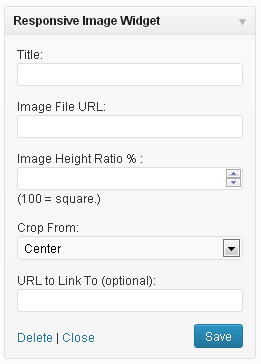 This is a very simple WordPress widget that displays a single responsive, rationally proportional image in a widget area. It helps make adding images with accurate proportions to sidebar areas quick and easy, and thus avoid a stretched or distorted appearance – without requiring any knowledge of HTML or even an image editing program.
Its key feature is that it allows proportional adjustment on the fly, so the user can easily change the proportion of the image inside of WordPress, instead of needing to resize the image in an editor (a problem for many WordPress users who do not have a lot of experience resizing/cropping images, or who simply don’t have image editing software available.)
It takes in a title, image URL, height to width ratio and target link URL. It outputs a rationally proportional frame (“div”) with the image set as a background. The image always fills the whole horizontal space (100%) of the widget, and can be cropped from the left, right, top, bottom, or centered.
Download the Widget! »
Screenshots of the widget output:
An example of a vertically rational image; the height is 200% of the width.
Here it is sized at 100% but in square format.
Here's the same image sized for a very horizontal image -- the height is 40% of the width..
Installation
- Download the widget.
- Go to “Plugins > Add new > Upload” in Wordpress, and upload “responsive_image_widget_11.zip” from your computer. Or, unzip and upload “responsive_image_widget.php” to the “/wp-content/plugins/” directory.
- Activate the plugin through the ‘Plugins’ menu in WordPress
- Place widget(s) in your sidebar areas through ‘Appearance > Widgets’ in WordPress
- Change the settings to your desiring and save!
(Expected) Frequently Asked Questions
-
Help! The image is gigantic and/or pixelated! The image always fills 100% of the width of the containing element (widget area). In other words, if the widget/widget area where the image is placed is large, the image will be large. So if your original image is only, say 200 pixels wide but the widget is 300 pixels wide the plugin will blow the image up to fill the 300 pixels and create the pixelation.To avoid this kind of pixelation, use an image that is at least as large as the widget area, or preferably larger than the widget area you plan to use it in.
-
Can the image only be placed on the side of the WordPress site like in the screenshots? Absolutely not! Just like all widgets, the Responsive Image Widget can be placed in any widget areas available in the active theme. In the future, we may also update it to include a shortcode feature, too.
Don’t hesitate to shoot us more questions in the comments! With any luck, the widget will soon be officially available through the WordPress Plugin Directory, in addition to here.
UPDATE: The plugin is now officially available on the WordPress plugins directory! That means it can be added directly from WordPress right here!